Customization and Localization Node
| Field | Description |
|---|---|
| File Customization |
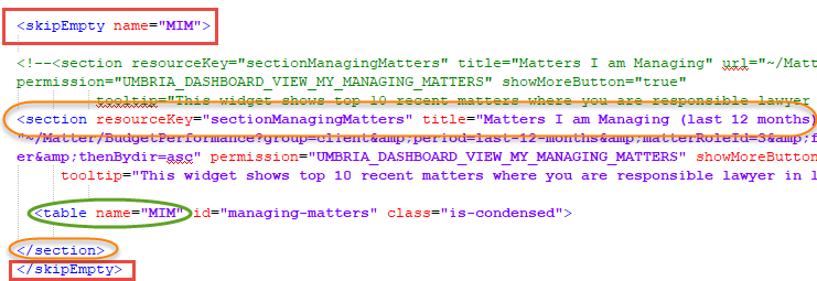
Here you can directly modify the XML for various screens, forms, and workflows within Umbria. Navigate through the folder structure and select a file to populate the XML on the right. You can copy the code from the Original tab and paste it onto the Custom tab, where you can make any desired edits. To discard your changes, click the Revert to Original button. The All Customized Files node will list all the modified XML files. The Frequently Customized Files nodes will list all the XML files frequently modified. Tip: To hide any of the widgets on the Partner/ Associate Dashboard (if they have no values to display), on the Partner/ Associate Dashboard XML, apply the tags <skipEmpty name = "table name for the section"> & </skip Empty> before and after the sections you want to hide. Note: To hide a property from the e-mail template when the value is empty, add the "hideEmpty=true" attribute. Do not enter any null value format other than "N/A" in the value attribute. To modify and update email notification templates, refer to instructions below. |
| Formula | Here you can define the custom formula to be applied on the Grid widgets, refer to instructions below. You can add formula to calculate and display KPI's values on the Grid charts. |
| Widget Drill Type | Here you can add custom drill though pages for your widgets, refer to instructions below. This is a feature you can add to the widgets created to display more detailed data in form of a pop-up window or link it to an external URL. |
| Widget | Here you can build custom KPI widgets to drill into any of your SQL based database and present key metrics on your dashboard. Refer to instructions below. |
| Dashboard | Here you can create a custom dashboard for the widgets. This page is added under the Reports tab on the Monitoring & Budgets Dashboard. Refer to instructions below. |
| Resource Cultures | Here you can modify the different resource cultures (country/language combinations) that are available for selection in User Settings. This determines the way the Umbria UI displays when code is available that is specific to a certain resource culture. |
| Resource Customization |
Here you can change the way labels display on each screen in Umbria in each available resource culture. Before making any modifications here, select the culture you are customizing from the Target Culture drop-down. Use the folder structure on the left to find the screen or form you wish to customize. Select the .xml or .cshtml file to populate a list of customizable labels.
Note: You can click the All Data button to view a list of all labels in Umbria, not just those in the currently selected file.
Tip: On Umbria version upgrade, it is recommended to click the Reparse Resource button located on the top right corner of the Resource Customization tab. This will add/update all the resource keys in the Umbria UI. Admin: Resource Customization>Select culture from Target Culture drop-down> Click Reparse Resource button. You may also use this option in case the modified resource keys do not show in the Umbria UI.
|
 Customizing & Styling Email Reports
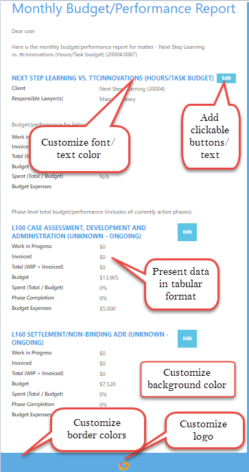
You can build custom email templates with different formats and layouts. Email templates can be edited to include different themes, text links, table grid structures, text highlights, report background and border colors etc. The new templates can also be viewed vertically on your mobile screens and can handle rich text, images, and data. To customize your email template:
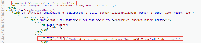
- Navigate to the default email styling sheet Default/Mailing/Style.css. You can customize this style sheet or you can copy the contents from this file and add custom styles to create a new style sheet. You can copy the contents into the Custom.css file placed in the same node.
- The main shared layout file for all email reports is Default/Mailing/StandardLayout.htm. Reference the updated css style sheet in this file. You can also customize the logo here.

View sample email templates below that illustrate the customizations that can be set up.
Mobile view of Performance Report
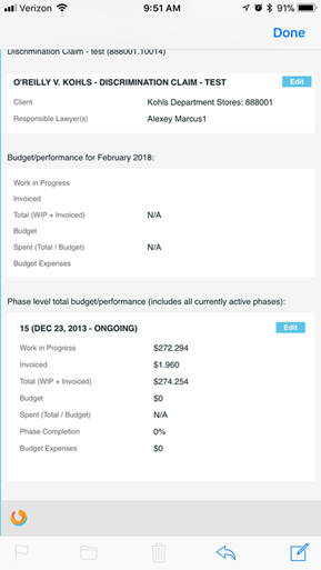
Tip: For mobile reports change the XML component for data presentation. For mobile reports, use <propertyGrid> as presentation element with labels and values. Desktop reports use tables to present tabular data.
Note: When you upgrade Umbria you may have to manually update your customized email templates. This will help avoid any errors and also align your templates with our new updates.
Formula
To create a custom formula:
- In the Admin Panel, type Formula in the Modules search field and click the magnifying glass icon. The folder tree narrows to show only those nodes matching the search criteria.
- Click Formula in the Customization and Localization folder.
- Click the Add button in the command bar. The Add Record pop-up window appears.
-
Type information in the provided fields, based on the table below, then click Save.
| Field | Description |
|---|---|
| Name | Enter a name for the formula. This appears in the Grid Config when selecting a formula to use, if the Calcutable option is selected. Make this as specific as needed to differentiate between similar formula that may exist. |
| Code | Enter a code for the formula. This is an optional field. |
| Formula Type |
Select the formula type from the drop-down. Options available are Budget, Profit, Experience, and Arrangement. |
| Formula | Enter a custom formula or logic for numbers to be calculated. For e.g. ({A}/{B})*100. The values in the bracket will be replaced with the Formula values selected in the in Widget>Grid Config. |
| Enabled | Check box to enable the formula for selection. |
Remember, to use these formulas or calculable columns in the exports, set the Exportable button to true for the KPI in the Grid Config of the Widget.
Widget Drill Type
To create widget drill through pages. This feature allows more information to be displayed from the information provided in the widget.
- In the Admin Panel, type Widget Drill Type in the Modules search field and click the magnifying glass icon. The folder tree narrows to show only those nodes matching the search criteria.
- Click Widget in the Customization and Localization folder.
- Click the Add button in the command bar. The Add Record pop-up window appears.
-
Type information in the provided fields, based on the table below, then click Save.
| Field | Description | ||||||||
|---|---|---|---|---|---|---|---|---|---|
| Name | Enter name for the widget drill type. This appears in the Widget Additional Config when selecting a drill through to use. Make this as specific as needed to differentiate between similar drill types that may exist. | ||||||||
| Alias | Type an alias name for the purpose of this drill type. This shows for reference in the Admin Panel only. | ||||||||
| Code | Enter a code for the drill type. This is an optional field. | ||||||||
| URL |
Enter the URL of the page to be opened via this drill type.
|
||||||||
| Enabled | Check box to enable the drill type and to make it available for selection in the node for Widget Additional Config. |
Access the Widget Drill Type in the Dashboard Widget
- In the Admin Panel>Widget node, select the widget where the drill type is to be applied.
- In the Widget Additional Configuration>configure the Drill through and save the changes.
- In the Dashboard > Reports tab select the Dashboard where the widget is applied. Select the widget and mouse hover or right click on the chart values to display the drill through options. Click to access the drill through information.
Note: Read detailed instructions here to allow the drill through page to be filtered as per the source dashboard page filters applied.
Widget
Build a customized widget to quickly provide you the information on the screen at a glance.Click to view the types of Widgets available.
To build a widget:
- In the Admin Panel, type Widget in the Modules search field and click the magnifying glass icon. The folder tree narrows to show only those nodes matching the search criteria.
- Click Widget in the Customization and Localization folder.
- Click the Add button in the command bar. The New Widget pop-up window appears.
-
In the node for Widget Info, type information in the provided fields, based on the table below, then click Save.
| Field | Description |
|---|---|
| Name | Enter Name for the widget. This appears in the Dashboard when selecting a Widget to use. Make this as specific as needed to differentiate between similar widgets that may exist. |
| Description | Type a summary for the purpose of this layout. The description shows for reference in the Admin Panel only. |
| Alias | Enter a name. This field is optional. |
| Enabled/Disabled | Select this option to enable or disable the widget to be used. |
| Widget Type | Select the type of widget from the drop-down. Click here to view the options available. |
| Data Source |
Select the data source to pull the information for the widget. Note:The widget / dashboard configuration is system independent. You can query the data from any SQL database outside of Umbria. To set up a Data Source add a connection string in the Caliban Config file. When adding a Tabular cubes database, always add a new connection string with a different name. The new connection string will ensure it does not delete the old cubes data on upgrade. |
| Use Umbria matter or person security. | Select if you want to apply permission at a Person (user) level or Matter level. |
| Design Mode | Leave this selection as Yes. |
| Entity Type | Select the Entity Type for the matter. If the widget is for Matter Reporting or Person. The option selected here also allows you to set security on the data displayed in the dashboard. If Matter is selected, then all the permissions applied for the Matter will follow. For e.g. if a user does not have access to a confidential matter then it will not be displayed in the DashBoard. If Person is selected, then based on the user access or permissions enabled, data is displayed in the Dashboard. |
| Design Mode |
Select the Design mode to be applied to the widget.
|
| Query Type |
Only available for Detail Configuration option. The current options supported are SQL, DAX, and MDX. |
| Modify Query |
Once you add a widget query, the Query field is disabled for edit. Select the relevant Generate Option radio button and check box to modify an exsisting widget query. |
| Generate Option |
Select the radio button for Detail Configuration to a write a widget query. Once a widget is created, an XML file is generated with an unique name for each widget under the File Customization node. The details of that XML file can be viewed by selecting the Control XML radio button. Note:The widget XML file can be viewed here: File Customization>Default>Widgets folder. The unique name added for each widget will help you identify the folder it is nested under. (for e.g. uniqueName="SpeedMeter_KpiBar_2018_8_2_12_12" i.e. widgetname_widgetfolder_year_month_date_hours_minutes). The details appended to the unique name ensures it does not overwrite any previous versions, if same widget are created by different users) |
| Query |
Update or configure your queries here. This task should be assigned to administrators or advanced power users to write queries to retrieve data from any SQL based system. |
- Click Next. Two additional nodes are displayed. The second node displayed here is based on the Widget Type selected in the previous screen.
Note: Based on the selected Widget Type different nodes are displayed. Refer details below.
- Widget Type : Grid/Pivot Grid/GroupBy Grid. In the node for Grid Info, the information is pre-populated with the details from the Data, Row, and Column configuration defined in the widget query. To edit click the pencil icon, click the Delete button to delete the record. Click Next to enter additional information in the node for Widget Additional Config.
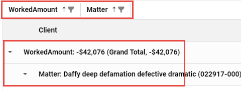
Pivot Grid widget is similar to the regular Grid widget but they provide additional functionality similar to an Excel Pivot table that allows you to drag and drop any of the available fields and quickly reorganize the data in the grid. This widget has a Field Chooser option in the Action menu. You can drag and drop the Column and the Data fields to add or remove the fields and summarize data in the grid.
| Field | Description |
|---|---|
| Page Size |
By default the page size is set to 30. |
| Action Items |
All the Action items are enabled by default. Check box to disable the option from the grid widgets.
Note: Click the |
| Data Field Config |
Refer details below |
| Row Config |
Refer details below |
| Column Config |
Refer details below |
 from the widget in the Dashboard. This option allows you to export the Grid widget data to an Excel report.
  icon from the widget in the Dashboard. This option allows you to choose the columns to be displayed in the widget. Click the
 icon on the Dashboard widget to access the Action menu items. The above Action Item options are only available for Grid/Pivot Grid/GroupBy Grid widgets.
 | Field | Description | ||||||||||||||
|---|---|---|---|---|---|---|---|---|---|---|---|---|---|---|---|
| Caption | Enter a caption. This appears as data field headers in the widget. | ||||||||||||||
| Calcutable |
Check this box to apply a formula for grid column calculations. Note: This option is only available for Grid Widgets. |
||||||||||||||
| Formula |
Select the formula from the drop-down. The options in the drop-down are pre-populated as defined in the Formula node. Note: This field is displayed if the Calcutable option is selected. |
||||||||||||||
| Formula Value |
Select the formula value to replace the core formula as defined in the Formula node. The options in the drop-down are pre-populated from the query defined in the earlier screen. Note: This field is displayed if the Calcutable option is selected. |
||||||||||||||
| Data Field Name |
Select the data field name from the drop-down. The options in the drop-down are pre-populated from the query defined in the earlier screen. Note: This field is displayed if the Calcutable option is not selected. |
||||||||||||||
| Data Field Type | Select the data field type. | ||||||||||||||
| Display Order | In case of multiple data fields, set the order in which the data fields are displayed. | ||||||||||||||
| Width | Enter the width for the data field column | ||||||||||||||
| Exportable | Check this box to enable the data fields to be exported in the Excel template. | ||||||||||||||
| Trend Title | Enter a title for the trend to be displayed on the UI. | ||||||||||||||
| Trend Field | Select the trend field from the drop-down. The options in the drop-down are pre-populated from the query defined in the earlier screen. | ||||||||||||||
| Trend Format |
Select the format from the drop-down. Options available are
|
||||||||||||||
| Trend Comparable Type |
Select the trend comparable type from the drop-down. This defines the calculation logic for the trend. Options available are
|
||||||||||||||
| Custom HTML Renderer | To enable this option, a Data Field Config with the Type HTMLTemplate must be added. Enter the HTML code to display data in the Dashboard. Use the properties from the widget query entered in the previous node. You can also add an image within the HTML template. To enable multiple HTML templates to be added to a grid widget, add multiple data HTMLTemplate data field types. To edit an HTML Template Renderer, on the Data Field Config panel, select the Data Field for the HTML Template and click the Edit option. | ||||||||||||||
| Aggregation Type | Select the aggregation type from the drop-down. Options available are Sum & Average. | ||||||||||||||
| Drill Through Options |
Select this option to drill through from the grid column to another dashboard report.
|
||||||||||||||
| Additional Config |
|
| Field | Description |
|---|---|
| Caption | Enter a caption. This appears as row name in the widget. |
| Row Level | Select the value for the row-level display field. The options in the drop-down are pre-populated from the query defined in the earlier screen. |
| Display Order | In case of multiple row fields, set the order in which the row fields are displayed. |
| Exportable | Check the box to enable export |
| Enabled | Check box to enable the row and display it in the widget |
| Field | Description |
|---|---|
| Caption | Enter a caption. This appears as column name in the widget. |
| Column Field Name | Select the value for the column-level display field. The options in the drop-down are pre-populated from the query defined in the earlier screen. |
| Exportable | Check the box to enable export |
| Enabled | Check box to enable the column value and display it in the widget |
- Widget Type: Chart. In the node for Chart Config, type information in the provided fields, based on the table below, then click Next. To edit click the pencil icon, click the Delete button to delete the record. Click Save + to add additonal rows. Click Next to enter additional information in the node for Widget Additional Config.
| Field | Description |
|---|---|
| Title | Enter a Title. This appears in the Dashboard layout in the UI. |
| Height | Define the chart height |
| Series Config | Here you can configure the data series plotted on the chart. Click the Add button. |
| Title | Enter a title for the series to be displayed on the chart. |
| Chart Type | Select the type of chart from the drop-down. |
| X Axis Display Field | Select the value for the X axis display field. The options in the drop-down are pre-populated from the query defined in the earlier screen. |
| X Field Value | Select the X field value. The options in the drop-down are pre-populated from the query defined in the earlier screen. |
| Y Field Value | Select the Y field value. The options in the drop-down are pre-populated from the query defined in the earlier screen. |
| Grouping Field | Select the data field to group the data. |
| X Axis (Title) | Enter the title for X axis. |
| X Axis Format Type | Select the format for the X axis |
| XAxis Allow Decimal | Check box to allow decimal values on chart. (Does not apply if Text Format selected in previous field). If unchecked the values will be rounded off and long decimal values will be displayed as M or B. |
| Y Axis (Title) | Enter the title for Y axis. |
| Y Axis Format Type | Select the format for the Y axis |
| YAxis Allow Decimal | Check box to allow decimal values on the chart. (Does not apply if Text Format selected in previous field) |
| X Axis (Categories) | Select the X Axis categories value. The options in the drop-down are pre-populated from the query defined in the earlier screen. |
| Y Axis (Categories) | Select the Y Axis categories value. The options in the drop-down are pre-populated from the query defined in the earlier screen. |
-
Widget Type : Lookup. In the node for Lookup Config, type information in the provided fields, based on the table below, then click Next. To edit click the pencil icon, click the Delete button to delete the record. Click Next to enter additional information in the node for Widget Additional Config.
| Field | Description |
|---|---|
| Caption | Enter a caption for the lookup widget. This appears in the Dashboard layout in the UI. |
| Key Field | Select the value from the drop-down. The options in the drop-down are pre-populated from the query defined in the earlier screen. |
| Value Field | Select the value from the drop-down. The options in the drop-down are pre-populated from the query defined in the earlier screen. |
| Format Template | Enter HTML query here to define lookup widgets with HTML display formats. You can add images to be displayed here with the drop-down lookup. |
| Page Size | Define the page size for the widget. |
| Paging Enabled | This is selected by default. |
| Multi Value | This is selected by default. |
| Sort Config |
Sorter Name: Add the sort name for the values in look up. Sort Direction: Add the sort direction for the values. Sort Order: Add the sort order for the values |
- Widget Type: KPI. In the node for KPI Config, type information in the provided fields, based on the table below, then click Next. To edit click the pencil icon, click the Delete button to delete the record. Click Next to enter additional information in the node for Widget Additional Config.
| Field | Description |
|---|---|
| Title | Enter a title for the KPI widget. This appears in the Dashboard layout in the UI. |
| KPI Type | Select the type of KPI to display in the dashboard. Click here to view the options available. |
| URL | Format the KPI as a hyperlink. Enter the URL here. |
| URL Param's | Select the URL parameters from the drop-down. The options in the drop-down are pre-populated from the query defined in the earlier screen. |
| Format | Select the format for the KPI to be displayed from the drop-down |
| Source Field | Select the source field from the drop-down. The options in the drop-down are pre-populated from the query defined in the earlier screen. |
| Target Field | Select the target field from the drop-down. The options in the drop-down are pre-populated from the query defined in the earlier screen. |
| Trend Field | Select the trend field from the drop-down. The options in the drop-down are pre-populated from the query defined in the earlier screen. |
| Trend Title | Enter a title for the trend |
| Trend Format |
Select the format of the KPI value from the drop-down. Options available are
|
| Trend Comparable Type |
Select the trend comparable type from the drop-down. This defines the calculation logic for the trend. Options available are
|
| Tooltip | Add a tool-tip to be displayed on the widget on mouse hover. |
| Width | Define the width for the widget size. |
| Field | Description |
|---|---|
| Compact KPI | 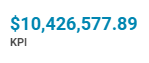
|
| Inline KPI | 
|
| Bar KPI | 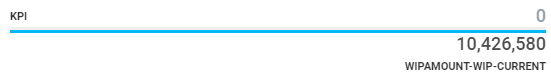
|
| Arc KPI | 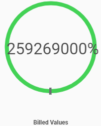
|
| Speedometer KPI | 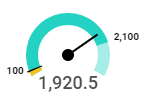
|
| Bullet KPI | 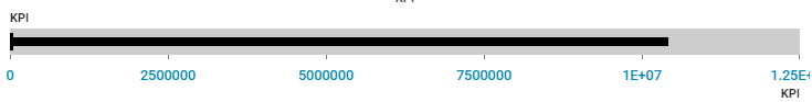
|
| Gradient Bar KPI | 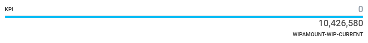
|
| Split Bar KPI | 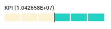
|
- Widget Type : Quick Action Panel.In the node for Action Panel Config, type information in the provided fields, based on the table below, then click Next. To edit click the pencil icon, click the Delete button to delete the record. Click Next to enter additional information in the node for Widget Additional Config.
| Field | Description |
|---|---|
| Command Name | Enter the command name. This appears in the Dashboard layout in the UI. |
| Path | Enter URL to redirect when clicked on the KPI. |
| Command Type |
Select the command type from the drop-down.
|
| Display Priority | In case of multiple widgets, set the order in which they display on the UI. |
| Security Permission | Add a permission to the widget. |
| Tooltip | Add a tool-tip to be displayed on the widget on mouse hover. |
- Widget Type: KPI And Chart Collection. In the node for KPI And Chart Collection Config, type information in the provided fields, based on the table below, then click Next. To edit click the pencil icon, click the Delete button to delete the record. Click Next to enter additional information in the node for Widget Additional Config.
| Field | Description |
|---|---|
| Orientation Type |
Select the view mode for the KPI on the Dashboard UI. Options available are
|
| Title | Enter the title name. This appears in the Dashboard layout in the UI. |
| KPI Type |
Select the type of KPI to display in the dashboard. Click here to view the options available. |
| URL | Format the KPI as a hyperlink. Enter the URL here. |
| Format |
Select the format of the KPI value from the drop-down. Options available are
|
| Source Field | Select the source field from the drop-down. The options in the drop-down are pre-populated from the query defined in the earlier screen. |
| Target Field | Select the target field from the drop-down. The options in the drop-down are pre-populated from the query defined in the earlier screen. |
| Trend Field | Select the trend field from the drop-down. The options in the drop-down are pre-populated from the query defined in the earlier screen. |
| Trend Format |
Select the trend format from the drop-down. Options available are
|
| Trend Comparable Type |
Select the trend comparable type from the drop-down. This defines the calculation logic for the trend. Options available are
|
| Display Order | In case of multiple widgets, set the order in which they display on the UI. |
| Tooltip | Add a tool-tip to be displayed on the widget on mouse hover. |
| Width | Define the width for the widget size. |
- Widget Type: IFrame: In the node for IFrame Config, type information in the provided fields, based on the table below, then click Next. To edit click the pencil icon, click the Delete button to delete the record. Click Next to enter additional information in the node for Widget Additional Config.
| Field | Description |
|---|---|
| Title | Enter a title for the widget. This will be displayed in the widget |
| URL | Enter URL for the page or site to be redirected to, when clicked on the widget. |
Note: To configure a Matter Header widget, in the Widget Info node, the Widget Type must be set to KPI and Chart Collection and the Design Mode must be selected as Header.
In the node for KPI And Chart Collection Config, type information in the provided fields, based on the table below, then click Next. Click Next to enter additional information in the node for Widget Additional Config.
| Field | Description |
|---|---|
| View Mode |
Select the view mode for the matter header. To customize and render the Matter Header, select Custom Template. |
| Title | Enter the title name. This appears in the Dashboard layout in the UI. |
| KPI Name |
Enter the KPI name. This appears in the Dashboard layout in the UI. |
| KPI Type | Select the type of KPI to display in the dashboard. Click here to view the options available. |
| URL | Format the KPI as a hyperlink. Enter the URL here. |
| Key(s) | |
| Format |
Select the format of the KPI value from the drop-down. Options available are
|
| Source Field | Select the source field from the drop-down. The options in the drop-down are pre-populated from the query defined in the earlier screen. |
| Trend Title | Enter a title for the trend field. |
| Target Field | Select the target field from the drop-down. The options in the drop-down are pre-populated from the query defined in the earlier screen. |
| Trend Field | Select the trend field from the drop-down. The options in the drop-down are pre-populated from the query defined in the earlier screen. |
| Trend Format |
Select the trend format from the drop-down. Options available are
|
| Trend Comparable Type |
Select the trend comparable type from the drop-down. This defines the calculation logic for the trend. Options available are
|
| Display Order | In case of multiple widgets, set the order in which they display on the UI. |
| Tooltip | Add a tool-tip to be displayed on the widget on mouse hover. |
| Width | Define the width for the widget size. |
| Custom HTML Renderer | To enable this option, a Data Field Config with the Type HTMLTemplate must be added. Enter the HTML code to display data in the Dashboard. Use the properties from the widget query entered in the previous node. You can also add an image within the HTML template. To enable multiple HTML templates to be added to a grid widget, add multiple data HTMLTemplate data field types. To edit an HTML Template Renderer, on the Data Field Config panel, select the Data Field for the HTML Template and click the Edit option. |
This widget also has an additional node for Widget Filter. The widget will only be displayed on the matters that match the widget filters applied. Use the filters to narrow down and make the appropriate selections to determine the matters for which the widget should be available.
- Widget Type: Tree Grid: In the node for Tree Grid Config , type information in the provided fields, based on the table below, then click Next. To edit click the pencil icon, click the Delete button to delete the record. Click Next to enter additional information in the node for Widget Additional Config.
| Field | Description |
|---|---|
| Paging Type |
|
| Page Size | By default the page size is set to 30. |
| Key Data Field |
Select the key data field from the drop-down. The options in the drop-down are pre-populated from the query defined in the earlier screen. |
| Parent Node Data Field |
Select the parent node data field from the drop-down. The options in the drop-down are pre-populated from the query defined in the earlier screen. Note:The parent node data field must be selected correctly for the widget to be displayed as a tree grid. |
| Action Items |
All the Action items are enabled by default. Check box to disable the option from the grid widgets.
|
| Data Field Config | Refer details below. |
| Field | Description |
|---|---|
| Caption | Enter a caption. This appears as data field headers in the widget. |
| Calcutable |
Check this box to apply a formula for grid column calculations. Note: This option is only available for Grid Widgets. |
| Formula |
Select the formula from the drop-down. The options in the drop-down are pre-populated as defined in the Formula node. Note: This field is displayed if the Calcutable option is selected. |
| Formula Value |
Select the formula value to replace the core formula as defined in the Formula node. The options in the drop-down are pre-populated from the query defined in the earlier screen. Note: This field is displayed if the Calcutable option is selected. |
| Target Data Field Name |
Select the data field name from the drop-down. The options in the drop-down are pre-populated from the query defined in the earlier screen. Note: This field is displayed if the Calcutable option is not selected. |
| Data Field Type | Select the data field type. |
| Display Order | In case of multiple data fields, set the order in which they display. |
| Width | Enter the width for the data field column |
| Exportable | Check this box to enable the data fields to be exported in the Excel template. |
| Trend Title | Enter a title for the trend to be displayed on the UI. |
| Trend Field | Select the trend field from the drop-down. The options in the drop-down are pre-populated from the query defined in the earlier screen. |
| Trend Format |
Select the format from the drop-down. Options available are
|
| Trend Comparable Type |
Select the trend comparable type from the drop-down. This defines the calculation logic for the trend. Options available are
|
| Aggregation Type | Select the aggregation type from the drop-down. Options available are Sum & Average. |
| Enabled | Check box to enable the data field. |
- In the node for Widget Additional Config, type information in the provided fields, based on the table below, then click Next.
| Field | Description |
|---|---|
| Drill Down Config | |
| Caption | Enter a caption for the drill down. |
| Drill Down Name | Select the drill down name from the drop-down. The options in the drop-down are pre-populated from the query defined in the earlier screen. |
| Drill Level | Set the drill level. |
| Drill Through Config | Add configuration to add a drill through pages to a widget |
| Caption | Enter a caption for the drill through menu. |
| Drill Through | Select the drill through name from the drop-down. The options in the drop-down are pre-populated as added in the Widget Drill Type |
| Key | Select the key from the drop-down. The options in the drop-down are pre-populated from the query defined in the Widget Info node. This option allows you to drill and filter the information in the target page as per the page filters applied in the source page. |
| URL Action |
Select the URL action for the drill through to open in. Options available are:
|
| Filter Config | |
| Filter Name | Select the filter name from the drop-down. The options in the drop-down are pre-populated from the query defined in the Widget Info node. |
| Operator | Select the operator for the filter from the drop-down. |
| Default Value | Enter a value for the filter name and operator to apply filter by. |
| Sort Config | |
| Sorter Name | Select the data field sort name from the drop-down. The options in the drop-down are pre-populated from the query defined in the Widget Info node. |
| Sort Direction | Select the sort order. Options available are Ascending and Descending. |
| Sort Order | Set the sort order for the columns. |
| Security Config | |
| Permissions | Select permissions to be applied to the widget. |
| Enable Access | Select user names to enable access to the widget. |
| Currency Default | Select the currency type for the widget. The default is set to United States Dollar. |
- In the node for Widget Security, select the widget security configuration. Type information in the provided fields, based on the table below, then click Finish
| Field | Description | |
|---|---|---|
| Visibility | ||
| Visible to All | The widget will be displayed to all users. | |
| Visible to Specified |
Restrict the widget visibility to the Roles and Groups defined here. On selecting this option, two additional drop-down fields are displayed.
|
| Widget Type | Image | Can be used |
|---|---|---|
| Grid | 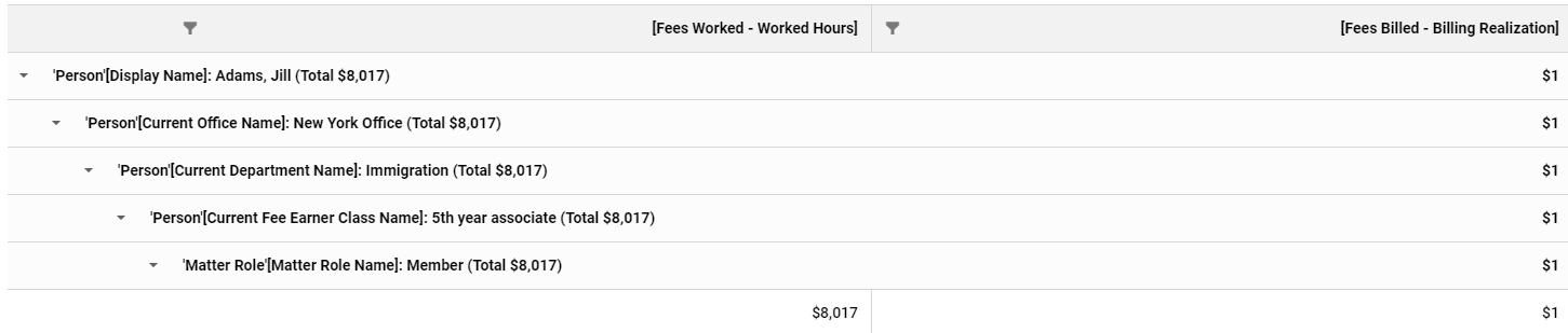
|
When comparing values against a single category and to display data in tabular format. |
| Pivot Grid | 
|
When comparing large values of data and to co-relate data across tables. You can also sort, group, and filter the data. |
| GroupBy Grid | ||
| KPI and Chart Collection | 
|
Display the KPI's in form of a KPI bar. |
| Chart | 
|
To organize and present large data to help make data easy to follow. Available options are Column Chart, Pie Chart, Scatter Chart, Line Chart, Bar Chart, Area Chart, Polygon Chart, Pyramid Chart, Funnel Chart, Spline Chart, Tree Map Chart, Stacked Column Chart. Stacked Bar Chart and Waterfall Chart. |
| KPI |
|
Add a simple widget to display the KPI value on the UI. You can select from the types of KPI's available. |
| Lookup | 
|
Add a look up drop-down field to filter and present data on screen. |
| IFrame |

|
Use this option to redirect to another page in form of a pop up window |
| Quick Action Panel | 
|
Add a button to redirect to a custom URL defined in the Admin widget node. |
To edit /delete a widget
- To modify a widget. select the widget click the Edit button .
- To delete a widget, select the widget and click the Remove button.
Copy a Widget
- Select a widget and click Copy Widget to create a clone of the widget. You can now edit this widget and use it as a base to build a new widget.
View the Dashboards where the widgets are used
- Select the widget and click the Where Used button. The Where Used window will list the dashboards where the widgets are placed.
Import Widgets
- To import, click the Import-Export button. From the drop-down select Import Widget Zip.
- In the Widget zip import window, browse and select the zip file.
- Click Send.
Export Widgets
- To export, select the widget and click the Import-Export button. From the drop-down select Export as Zip.
- The zip file containing the XML document and the JSON file is downloaded to your system.
Export to Excel
Based on the configuration defined in the Grid config and the columns set as Exportable, an Excel template is generated for each widget. To generate a template:
- Click the
 icon on the extreme right of the widget row.
 - An Excel template is generated and downloaded to your system.
- You can edit the details in the Excel template and re-import the template to over-write the existing version.
- To change the templates for all widgets at one go, check the box against Name to select all widget and from the Import-Export drop-down, select Regenerate Export Template. This will auto apply the new template to all the widgets.
Note: The out-of-the-box generic widget templates are available in ~\Prosperoware.Umbria\App_Data\Seed\Widget folder. You can customize the template to change the color scheme or add a logo and use it to generate the widget template
Tip: Click the Regenerate Export Template option to resolve any widget data export errors.
Clear Widget Cache
To update the widget after any cube updates or if the query is modified
- To manually clear the widget cache, in the Administration>Widget node, select the widget to be updated and click Clear Cache option on the toolbar.
- A new background service BustCache is also added to auto clear the cache from the IIS server. This service can be enabled in the Administration>Manage>Service Agents node. This service is scheduled to run and reset the cache every 30 minutes.
Note: By default, the cache is stored in the IIS server. This background service must be enabled on the IIS server only. Do not enable it on Windows service. Enabling on both may cause the cache to be not cleared from the IIS server, resulting in failure to auto update the widget data.
Regenerate Export Templates
To change the templates for all widgets at one go, check the box against Name to select all widget and from the Import-Export drop-down, select Regenerate Export Template. This will auto apply the new template to all the widgets.
Reprocess Widgets
Click this option to apply data architecture changes to all the widgets at one go. You need not edit and save each widget when there is any change in the framework. The reprocess command successfully saves the widget configuration without having to Edit and Save each widget individually.
Note: This option will re-process all selected widgets.
Dashboard
To create a dashboard for the reports:
- In the Admin Panel, type Dashboard in the Modules search field and click the magnifying glass icon. The folder tree narrows to show only those nodes matching the search criteria.
- Click Dashboard in the Customization and Localization folder.
- Click the Add button in the command bar. The New Dashboard pop-up window appears.
-
In the node for Dashboard Info, type information in the provided fields, based on the table below, then click Save.
| Field | Description |
|---|---|
| Dashboard Name | Enter a name of the Dashboard. This appears as the Report name in the UI. This is a required field. |
| Title | Enter a Title. This appears as the Dashboard name in the UI. This is a required field. |
| Description | Type a summary for the purpose of this dashboard. The description is displayed in the Report Description column in the UI |
| Dashboard Types |
Select the type of Dashboard. Options available are:
|
| Entity Type |
Select the Entity type from the drop-down. Only displayed for Object Specific Dashboard Type. Based on the Entity type the second node in the Dashboard Config is displayed to enter the entity filter information. Tip: Select Pricing Plan entity type to create a Pricing Plan dashboard. |
| Page Design Type |
|
| Show in Navigation | Select Yes to add the Dashboard in the entity navigation pane. |
| Show in Entity Reports | Select Yes to add the Dashboard in the Entity Reports navigation. |
| Enabled/Disabled | Select this option to enable or disable the dashboard. A disabled Dashboard will not display on the Reports tab. |
| Dashboard Filters | |
| Filter Types | Select the filter type to be displayed on the dashboard page. |
| Mapped Field | Select the field to be mapped to the filter. |
| Use | Select the Generate Filter option to apply the filter (as a Global Filter) on the dashboard, or to pass the filter as a parameter (input a value for the query to run and filter), select Pass as Parameter. The Pass as Parameter option will connect all the filters and the data sets on the dashboard. |
- The second node displayed in the Dashboard Config dialog, is dependent on the Entity Type selected. In the Entity Filter Node select the filter criteria for the entity. If the matter or user meets the filter criteria, then the dashboard is displayed in the matter navigation pane, only to the user role selected here. For e.g. If the selected Entity Type is Matter and the filter specified for "Matter Type": is "Litigation" and "Team Member Matter Role": is "Responsible Lawyer", then when navigating to a litigation matter as responsible lawyer the user will see the report in the matter navigation. This dashboard will not be displayed to other user roles.
- The Dashboard reports can be accessed from the Reports tab on the Monitoring & Budgets Dashboard.
Note: You can also add a Dashboard from the Monitoring & Budgets>Reports tab.
To edit /delete a Dashboard
- To modify a dashboard, select the dashboard click the Edit button .
Widgets Used
Select the dashboard and click the Where Used button. The Widgets window will list the widgets used in the selected dashboard.
Out Of Box Dashboard(s)
Click this option to save and import the out-of-the-box-dashboards. The out-of-the-box dashboards are available in the folder if needed~\Prosperoware.Umbria\App_Data\Seed\Dashboards
- All the out-of-the box dashboards available are listed in the dialog. Select the dashboard(s) to import to the Dashboard node and click Save.
Importantly, import the dashboards in this order (this list is effective as of 11/26/2019). The order is:
- 00001_MatterMonitorSummary
- 00002_MonitoringAlert.zip
- 00003_MatterHeader
- 004_PhaseResourceLevelReport
- 00021_PhaseOverview.zip
- 00005_ByPhase.zip
- 00014_Drill Through Dashboard - Time Report.zip
- 00013_Drill Through Dashboard - Person Report.zip
- 00006_ByPhaseDetailed.zip
- 00015_Drill Through Dashboard - Fee Earner Report.zip
- 00007_Hours.zip
- 00016_Drill Through Dashboard - Time Report Hourly.zip
- 00008_ByMonthHourly.zip
- 00009_MatterRateCard
- 00012_PersonMonthlyReport.zip
- 00011_PersonReport.zip
- 00010_Person.zip
- 00017_PhaseByHours.zip
- 00018_PhaseByValue.zip
- 00019_RunRate.zip
- 00020_ClientRateCard.zip
- 00022_ByMonthHourlyCombined.zip
- 00023_PlanOverview.zip
- 00024_ByOfficeDepartment.zip
- 00025_KPICollection.zip
Warning: If this order of installation is not followed, there can be issues importing the dashboards, or failures using the dashboards.
Note: On a fresh installation, the out-of-the-box dashboard(s) must be imported.
Import Dashboard
- To import, click the Import-Export button. From the drop-down select Import Dashboard Zip.
- In the Widget zip import window, browse and select the zip file.
- Click Send.
Export Dashboard
- To export, select the widget and click the Import-Export button. From the drop-down select Export as Zip.
- The zip file containing the Dashboard XML is downloaded to your system.
Note: The new 2019.2.1 and higher versions allow for drill through and other dashboards to be used across different systems. Just export the drill through dashboards, and their subsequent high level dashboard, and import first the drill through dashboard, then the other dashboard(s).
Reprocess Dashboard
Click this option to apply data architecture changes to all the dashboards at one go. You need not edit and save each dashboard when there is any change in the framework. The reprocess command successfully saves the dashboard configuration without having to Edit and Save each dashboard individually.
Note: This option will re-process all selected widgets.
Edit Security
- To edit dashboard security, select the dashboard and click the Edit Security button.
-
From the User/Group drop-down select the user or group to share access to the dashboard
- Select the Role to be assigned to the User/Group.
- Click the Save button to save any changes made. Click Save+ to add another user group and role.
Tip: Read here for more details to assign dashboard security.